 Infographics. Seems pretty self-explanatory. Information + Graphic Design = Infographic. According to Wikipedia, an Infographic is a “graphic, visual representation of information, data or knowledge intended to present complex information quickly and clearly.” While that generally sums it up, there is still a lot of confusion swirling around this new form of content collateral. So, we’re here to help explain what makes Infographics such a great and useful tool in getting more customers.
-
- They’re eye-catching.
Infographics can take otherwise tedious information – ratios, statistics, data, or even just plain old “good to know, boring to take in” material – and make it intriguing. They can take almost any form, from a more beefed up top ten list to a cool flow chart to an interactive image that includes lists, maps, charts, gifs, flows, and links. Some Infographics are so creative, they even border on being art.
-
- They’re informative.
Duh. I mean, that’s the whole point of an Infographic – to tell people something they need to know. But this way people might actually listen! With all the emails people receive day in and day out, text messages, online articles, tweets and Facebook posts – finding a way to convey important information without competing with a prospect’s overloaded word count is crucial.
-
- They’re effective.
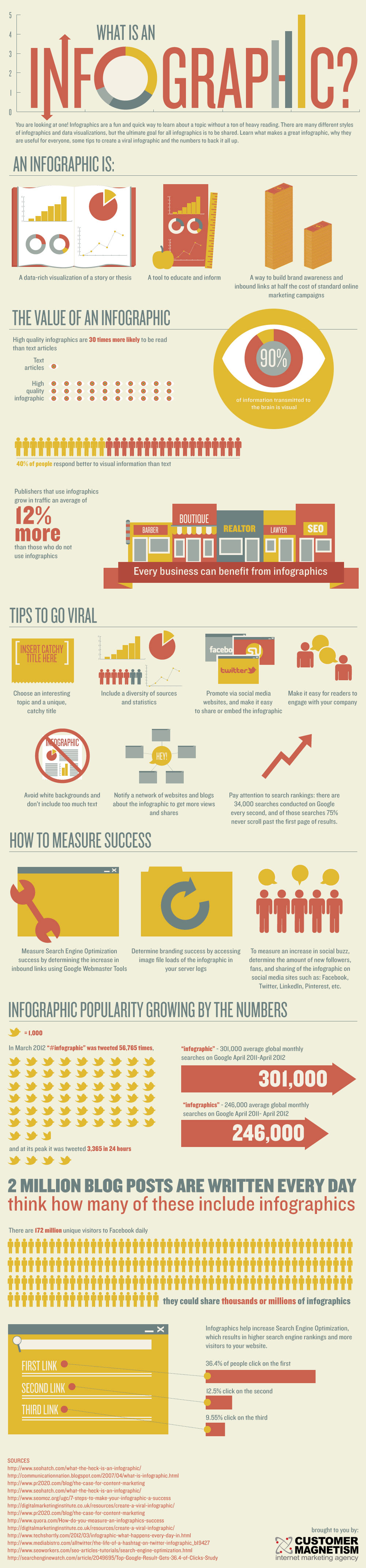
High quality Infographics are 40 times more likely to be read than a text article. That’s because 90% of the information transmitted to the brain is visual, which in turn makes for the 40% of people who respond better to visual information than text. As a result, businesses that utilize Infographics grow an average of 12% more in web traffic than businesses who don’t.
-
- They’re concise.
A lot of Infographics meld together complicated weavings of information that might take pages and pages of text to convey. But by being able to put it into a graphical flow, the information and the visual aids work in tandem to create clarity on a complex topic.
-
- They’re cool.
Before the periodic table and Darwin’s Evolutionary Tree of Life, combining graphics and information for explanatory purposes was not very common. Probably because they took forever to construct and were not easily recreated. But over the last two decades there have been some major transformations in the world of business, social interactions, and how information is used, consumed, and stored. It’s now easier than ever to combine words and art into a singular form to say something that could otherwise not really be said. And even more, the World Wide Web has created a space for people to share such visually stunning informational masterpieces. It’s pretty cool, really.
Interesting Infographics to check out:
- The Scale of the Universe. Simply because it will blow you mind (all that Infographics can do). http://htwins.net/scale2/
- A Graphic to Define Infographics. http://www.customermagnetism.com/wp-content/uploads/2012/11/what-is-an-infographic.jpg
- A collection of the best current Infographics. http://www.bestinfographics.co/
- Top Ten Prospecting Voicemail Don’ts. https://www.klagroup.com/top-ten-prospecting-voicemail-donts-infographic

